The Little Potato Co. reveals brand refresh
The Little Potato Co. has unveiled a new brand look and feel.
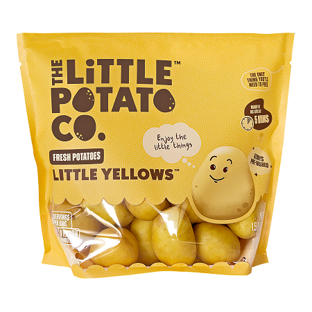
The brand refresh reflects its commitment to providing busy families with quick and easy meal solutions so they have more time for what matters most, according to a news release. The new visual identity features modern, vibrant, fresh colors and a new logo, the company said. The rebrand also includes new family-friendly packaging with updated product names, new brand characters, a refreshed website and social channels and a new digital ad campaign.
Sold in the U.S. and Canada, colorful little potatoes from The Little Potato Co. are sold pre-washed with no peeling required and can be cooked in just five minutes, the company said.
“We did extensive research to deeply understand our consumers, and what they care about is feeding their families with healthy, easy meals and finding moments of connection and joy together,” Angela Santiago, CEO and co-founder of The Little Potato Co., said in the release. “We refreshed the brand with a new brand promise, to bring little moments of happiness to busy families. We bring that to life in every element of our relaunch, from the colorful logo, to our characters, and our heartwarming ad campaign.”
The new packaging is designed to stand out on the shelf, with a clear window to spotlight the fresh, whole food within, the release said. The new packaging further brings the brand’s positioning to life by highlighting key differentiators, like the easy prep with no need to wash or peel, and the short cooking time (in as little as five minutes) as well as cooking methods — like air frying — to make preparation even easier, according to the release.
The packaging also includes a family message from the brand’s father-and-daughter founders and sustainability messaging about the family farms. The refresh includes simplified product names beginning with “Little” to reinforce the branding and highlight the size of potatoes, along with the color/varietal or flavor, the release said.
New brand characters are also featured on the pack: the Spuddies are yellow, red and purple little potatoes who share messages like “enjoy the little things,” “fresh from our family farms” and “a little win for a busy night at home.”
Starting March 28, the brand refresh will be supported by a digital ad campaign running across North America featuring heartwarming videos of the Spuddies sharing dinnertime wisdom. The new packaging is beginning to roll out on shelves in March, and the refreshed website and social channels are live as of March 15, the release said.
“Families today are incredibly busy, but we know that sharing a home-cooked meal provides for invaluable family time and conversation,” Santiago said in the release. “As a family-owned company we’re passionate about making it easier for families to enjoy a little moment of happiness together by making dinner easier through our convenient and delicious Little potato products.”